Set up a profile with advanced layouts
Overview
The below sample profile shows how the following layouting effects can be achieved by using Vaadin’s standard layout components:
Tabbed content
Two (or more) vertical columns
Dividing horizontal space unevenly between components
Content that wraps to match available space
Setting a specific predetermined width to a component
Sample profile code
<!doctype html>
<html>
        <head>
                <meta name="package-mapping" content="custom:fi.fasolutions.app.pfmgmt.component"/>
        </head>
        <body>
                <vaadin-vertical-layout>
                        <vaadin-tab-sheet size-full>
                                <tab caption="Two columns" selected>
                                        <vaadin-horizontal-layout size-full>
                                            <vaadin-vertical-layout size-full>
                                                <vaadin-label><h2>Left column</h2></vaadin-label>
                                                <vaadin-text-field id="twoColumns.left1" caption="Left column 1" data-item-type="java.lang.String" size-full/>
                                                    <vaadin-text-field id="twoColumns.left2" caption="Left column 2" data-item-type="java.lang.String" size-full/>
                                                    <vaadin-text-field id="twoColumns.left3" caption="Left column 3" data-item-type="java.lang.String" size-full/>
                                            </vaadin-vertical-layout>
                                                <vaadin-vertical-layout size-full>
                                                    <vaadin-label><h2>Right column</h2></vaadin-label>
                                                <vaadin-text-field id="twoColumns.right1" caption="Right column 1" data-item-type="java.lang.String" size-full/>
                                                    <vaadin-text-field id="twoColumns.right2" caption="Right column 2" data-item-type="java.lang.String" size-full/>
                                                    <vaadin-text-field id="twoColumns.right3" caption="Right column 3" data-item-type="java.lang.String" size-full/>
                                            </vaadin-vertical-layout>
                                        </vaadin-horizontal-layout>
                                </tab>
                                <tab caption="Horizontal layouts">
                                        <vaadin-vertical-layout size-full>
                                            <vaadin-horizontal-layout size-full>
                                                <vaadin-text-field id="horizontalLayout.smallField" caption="Small field" data-item-type="java.lang.String" size-full :expand="0.5"/>
                                                <vaadin-text-field id="horizontalLayout.mediumField" caption="Medium field" data-item-type="java.lang.String" size-full :expand="1.0"/>
                                                <vaadin-text-field id="horizontalLayout.largeField" caption="Large field" data-item-type="java.lang.String" size-full :expand="2.0"/>
                                            </vaadin-horizontal-layout size-full>
                                        </vaadin-vertical-layout>
                                </tab>
                                <tab caption="CSS Layout">
                                        <vaadin-css-layout size-full style-name="checkboxes">
                                                <vaadin-check-box id="advancedLayout.css1" caption="Checkbox with a long text 1"/>
                                                        <vaadin-check-box id="advancedLayout.css2" caption="Checkbox with a long text 2"/>
                                                        <vaadin-check-box id="advancedLayout.css3" caption="Checkbox with a long text 3"/>
                                                        <vaadin-check-box id="advancedLayout.css4" caption="Checkbox with a long text 4"/>
                                                        <vaadin-check-box id="advancedLayout.css5" caption="Checkbox with a long text 5"/>
                                                        <vaadin-check-box id="advancedLayout.css6" caption="Checkbox with a long text 6"/>
                                                        <vaadin-check-box id="advancedLayout.css7" caption="Checkbox with a long text 7"/>
                                                        <vaadin-check-box id="advancedLayout.css8" caption="Checkbox with a long text 8"/>
                                                        <vaadin-check-box id="advancedLayout.css9" caption="Fixed-width component" width="60px"/>
                                                        <vaadin-label><style>.checkboxes .v-checkbox{ margin: 10px; }</style></vaadin-label>
                                        </vaadin-css-layout size-full>
                                </tab>
                        </vaadin-tab-sheet>
                </vaadin-vertical-layout>
        </body>
</html>
Tabbed content
A tab sheet may be added with the <vaadin-tab-sheet size-full> -tag, with <tab caption="Two columns" selected> tags underneath. Note the “size-full” attribute on the tab sheet component (and various other layouts in this example), which indicates that the component should expand to its full available size.
Note, that the TabSheet must be placed within a layout, and each tab’s content must also start with a layout.
Two (or more) vertical columns
Two or more vertical columns can easily be achieved by defining a Horizontal Layout, and two (or more) Vertical Layouts beneath it. We can adjust the relative width of the two columns by defining an :expand -attribute to the content within the Horizontal Layout - in this case the two (or more) vertical layouts.
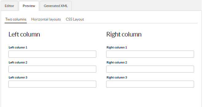
Image 1 - Two evenly split vertical columns
Note
Two (or more) horizontal columns could similarly be achieved by defining two (or more) Horizontal Layouts within a Vertical Layout.
Dividing horizontal space unevenly between components
Any components that are direct children of a Horizontal layout may be given an :expand -attribute. The value of that attribute is a relative number; horizontal space within the layout is allocated based on the components' relative values of the expand-attribute. E.g. in the example case, the small field receives 0.5 / (0.5 + 1.0 + 2.0) = 1/7 of the horizontal space.
Because we defined our layouts to expand to the full space available with the size-full -tag, our layout and all the components within it grows and shrinks along with the size of the window within which the profile is shown.
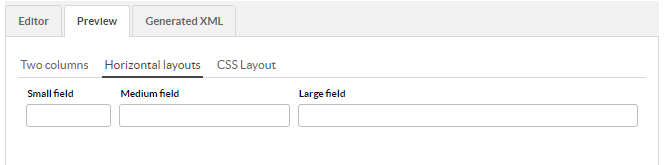
Image 2 - Defining an expand ratio for components within a Horizontal layout
Content that wraps to match available space
If you want to keep placing components next to each other as long as they fit, then overflow the next component to the beginning of the next row, you can achieve this with a CSS Layout.
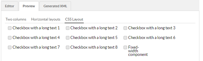
Image 3 - Overflowing checkboxes with the help of CSS Layout
With a wide screen, all the checkboxes might fit on a single line. With a tiny screen, each checkbox would have its own row.
Note, that you can also use CSS Layout if you want to define your components' layout through CSS instead of relying on Vaadin’s built-in layouts components. This sample shows how you can do that, as well: the CSS layout contains a Label-component, within which we enter a <style>-block which contains a bit of CSS.
Note, that because we defined our CSS within the CSS Layout -tab, it will only have an effect as long as we keep that tab open. If we wanted to define styles that affect the other tabs as well, we could do that by placing the <style>-label under the outermost vertical layout instead.
Note
You can enter any HTML you wish within a Label-component, including <style>-tags. The “Left column” and “Right column” headings were done with a Label containing <h2>-tags.
Fixed-width vs resizable components
The components on the first and second tabs all dynamically resize depending on the size of the window, because we have an unbroken chain of size-full tags from the root layout, through the intermediate layouts all the way down to the components themselves. The components on the third tab, on the other hand, have no specified width (aside from the last checkbox). That means the components will take up as much space as their content requires - no more, no less. These components will not shrink or grow with the window. Finally, the last component has a fixed size of 60px; this sets the component’s width explicitly to 60px regardless of that component’s content. A component with a fixed width will also not shrink or grow.