Custom components in a profile
Overview
In addition to standard Vaadin components, FA has custom components that you can use in profiles.
Standard components
Standard components are Vaadin components that can be used without importing any additional namespace declarations. Common standard components are listed in the table:
Component | Data type | Notes / Example | Examples | |
Header | String | <vaadin-label caption="Header"></vaadin-label> |
| |
TextField | String | <vaadin-text-field id="isinCode" caption="ISIN"></vaadin-text-field> |
| |
TextField | String |
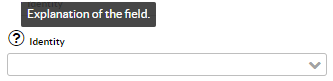
<vaadin-combo-box caption="Identity" icon="fonticon://Vaadin-Icons/e72f" description="Explanation of the field." id="Identity"> <option item="1" enabled="false">Known</option> <option item="2" enabled="false">Unknown</option> </vaadin-combo-box> |
| |
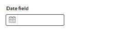
DateField | String | <vaadin-date-field id="vaadin.date.field" caption="Date field" date-format="yyyy-MM-dd"/> |
| |
RadioButtonGroup | String | <vaadin-radio-button-group id="Citizen" caption="Swedish citizen"> <option item="Yes">Yes</option> <option item="No">No</option> </vaadin-radio-button-group> |
| |
Checkbox | Boolean | <vaadin-check-box id="ETF" caption="ETF"/> |
| |
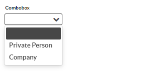
Combobox | String | <vaadin-combo-box caption="Combobox" id="Combo" data-item-type="java.lang.String"> <option item="Privateperson">Private Person</option> <option item="Company">Company</option> </vaadin-combo-box> |
|


Custom components
The custom components assume the following namespace declarations:
<head>
    <meta name="package-mapping" content="fa:com.fasolutions.vaadin.components">
    <meta name="package-mapping" content="pop:com.fasolutions.vaadin.components.populatable">
    <meta name="package-mapping" content="custom:fi.fasolutions.app.pfmgmt.component"/>
    <meta name="package-mapping" content="ext:com.fasolutions.ext.components">
</head>
Custom components are listed in the table:
Component | Namespace | Data type | Notes / Example | Examples | |
|---|---|---|---|---|---|
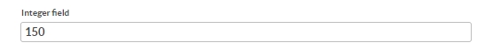
DesignIntegerField | com.fasolutions.vaadin.components | Integer | Simple whole-number field <fa-design-integer-field caption="Integer field" id="x.integerField"/> |
| |
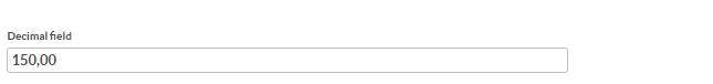
DesignNumberField | com.fasolutions.vaadin.components | Double | Simple decimal-number field. Supports the decimal-format and locale attributes <fa-design-number-field id="x.decimalField" caption="Decimal field"/> |
| |
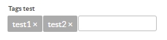
TagsField | com.fasolutions.vaadin.components | Multiselect String | Tags field <fa-tags-field id = "x.tags" caption="Tags test" tags="test1,test2,test3"/> |
| |
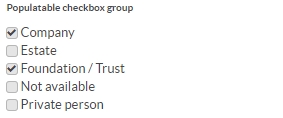
PopulatableCheckBoxGroup | com.fasolutions.vaadin.components.populatable | Multiselect String | <pop-populatable-check-box-group id = "x.pop7" caption="Populatable checkbox group" populate="Juridical"/> |
| |
PopulatableComboBox | com.fasolutions.vaadin.components.populatable | String | <pop-populatable-combo-box id = "x.pop9" caption="Populatable combobox (LightContact)" populate="LightContact"/> |
| |
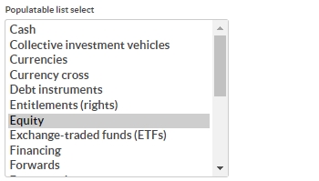
PopulatableListSelect | com.fasolutions.vaadin.components.populatable | Multiselect String | <pop-populatable-list-select id = "x.pop3" caption="Populatable list select" populate="TransactionType"/> |
| |
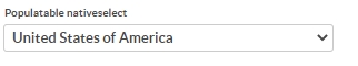
PopulatableNativeSelect | com.fasolutions.vaadin.components.populatable | String | <pop-populatable-native-select id = "x.pop8" caption="Populatable nativeselect" populate="Country"/> |
| |
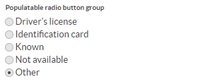
PopulatableRadioButtonGroup | com.fasolutions.vaadin.components.populatable | String | <pop-populatable-radio-button-group id = "x.pop5" caption="Populatable radio button group" exclude="BANKID;PASS" populate="Identity"/> |
| |
PopulatableTagsField | com.fasolutions.vaadin.components.populatable | Multiselect String | <pop-populatable-tags-field id = "x.tags2" caption="Populatable tags test" populate="Country"/> |
| |
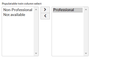
PopulatableTwinColSelect | com.fasolutions.vaadin.components.populatable | Multiselect String | <pop-populatable-twin-col-select id = "x.pop6" caption="Populatable twin col select" populate="Classification"/> |
| |
CustomPopupDateField | fi.fasolutions.app.pfmgmt.component | String | <custom-custom-popup-date-field id="custom.date.field" caption="Custom date field" date-format="yyyy-MM-dd"/> |
| |
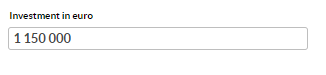
IntegerSpacing | com.fasolutions.ext.components | Integer | <ext-design-integer-field id="InvestmentSize" caption="Investment in euro"></ext-design-integer-field> |
|


Populatable components have following custom attributes related to the population of the data:
Attribute | Description | Mandatory / Optional | Values |
|---|---|---|---|
populate | Defines what data component is populated with | Mandatory | Asset, AssetType, Benchmark, CostType, Country, Exchange, Group, PortfolioGroup, PortfolioType, Language, ClassType, ClassType2, ClassType3, ClassType4, ClassType5, Classification, Classification2, Classification3, ContactSubType, Juridical, TransactionType, Identity, Contact, ContactType, TaxType, Security, SecurityType, SecuritySubType, Settlement, ContactTags, LightPortfolio, PortfolioTags, PortfolioAccountTags, TransactionTags, TradeorderTags, SecurityTags, LightPortfolio |
model-getter | Is be used to define which attribute value is saved in the data base. E.g. model-getter=”name” to save the name of the selection, which is nice, because that makes the human-readable version easily available in the search views. | Optional |
|
exclude | This option can be used to remove specific items from the list. It is given as a semicolon-separated list of identifiers, e.g. contact IDs if populating the component with Contacts or LightContacts. If model-getter is used, then exclude should be a semicolon-separated list of the defined identifiers. | Optional |
|
include | This option works like exclude, but the other way around: only the items defined in the semicolon-separated list are populated. Note, that if your list of items includes something that is not found in the database, it will not be added to the list of available selections. | Optional |
|